The True Leader
About Project
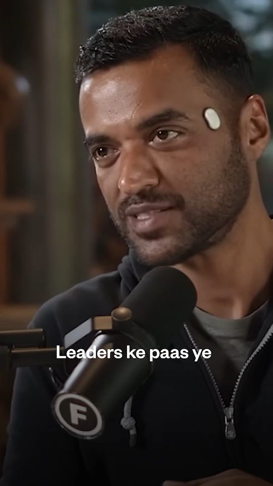
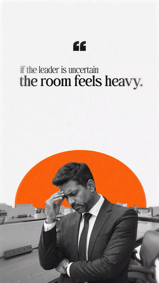
This project is an intensive exercise in psychological motion design and narrative pacing. Based on insights from Deepinder Goyal, the edit transforms a standard interview into a high-impact visual essay. Every element—from the kinetic typography to the symbolic B-roll—was engineered to visualize the "weight" of leadership. I handled the entire pipeline: conceptualizing the visual metaphor of the "environment," executing the complex 2D motion overlays, and layering a custom soundscape to drive the emotional tension of the message. This video was edited and designed by me for Midas Studio.
Category
Premium Short-Form/Kinetic Social Clips
Start Date
February 02, 2026
Challenges
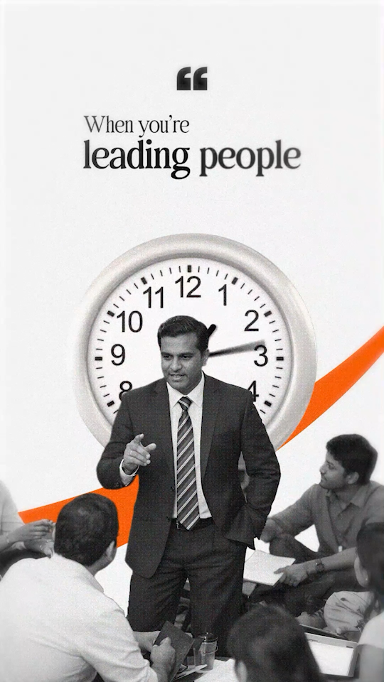
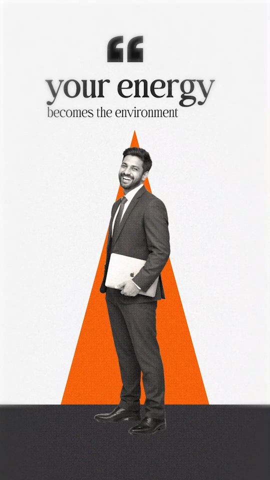
Visualizing the Abstract: The core concept—that a leader’s energy becomes the “environment”—is an abstract psychological idea. Translating that into a literal visual language that a viewer can understand in 30 seconds was the primary hurdle.
Maintaining Pacing without Fatigue: Short-form content often suffers from “over-editing.” The challenge was keeping the energy high with rapid motion graphics while ensuring the viewer had enough cognitive space to actually absorb the leadership advice.
Audio-Visual Synthesis: Creating a soundscape that felt professional and “heavy” enough to match the serious tone of the topic required precise sound design, ensuring the SFX emphasized the motion without distracting from the voiceover.
MY APPROACH
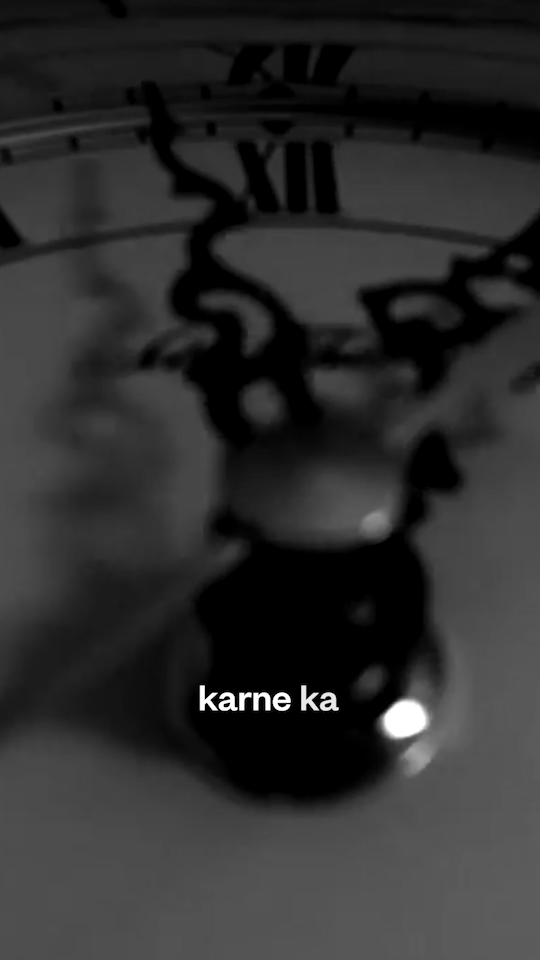
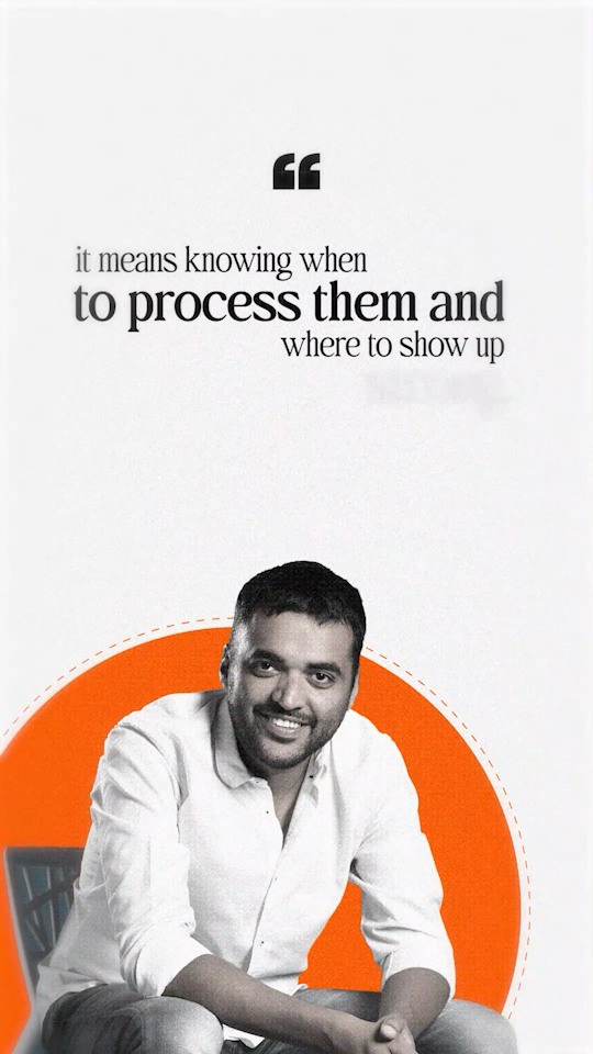
I used a rigorous storyboarding process to ensure that every visual transition served the narrative. When the video mentions "the room feels heavy," I purposefully adjusted the color grading and motion speed to create a visceral shift in tone. Instead of random subtitles, I used Kinetic Typography as an anchor. The text isn't just there to be read; it’s animated to emphasize the "staccato" nature of the speech, making the delivery feel more authoritative. To maintain a "premium" feel, I stuck to a unified style guide—using clean lines, specific geometric shapes (the orange semicircle), and a consistent font. This kept the focus on the message while signaling a high production value.